Matte or Gloss: What Changes on a Printed Page?
Matte or gloss changes how a printed page handles glare, color, and touch. Learn which finish suits your paper, lighting, images, and reading habits.
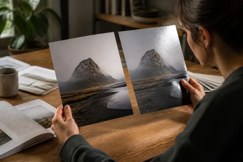
You tilt a new print toward the window, and the photograph seems to change: one angle makes it glow; another throws a pale reflection across the subject. That shift is part of the choice between matte or gloss, a finish decision that affects how a printed page looks, feels, and behaves under light.
Neither finish is simply “better.” Gloss tends to make colors look vivid and dark areas feel deep, while matte softens reflections and gives the surface a quieter character. The right pick depends on what the page needs to show and where someone will look at it.
What does matte or gloss mean on a printed page?
Matte and gloss describe the surface sheen of a print, not the ink design itself. A glossy coating or paper surface reflects light more directly, creating noticeable highlights. A matte surface scatters more of that light, so reflections are usually broader and less mirror-like.
Printers and paper suppliers also offer finishes between the two, such as satin, silk, or luster. Names vary by product, so treat them as clues rather than a universal scale. A satin sheet often has some color snap without the sharp glare of a high-gloss surface.
Finish can come from the paper’s coating, a separate varnish, or a laminate. Those choices may affect both the look and the tactile impression, so “matte paper” and “matte coating” are not always interchangeable descriptions. If a job has a particular stock or finishing treatment in mind, check the product label and printer guidance before committing.
How does gloss change color and detail?
Gloss often makes a printed image feel more saturated and contrasty. The smooth surface can give colors a lively, polished appearance, while dark tones may look especially rich. This effect can suit photographs with strong color, glossy product images, or artwork meant to feel bright and crisp.
That visual lift comes with a tradeoff: highlights from lamps and windows can compete with the image. A glossy page may look striking in one position and distracting after a reader shifts their chair. Fine details remain on the page, but a reflection can make them harder to see from a particular angle.
Gloss also gives photographs a familiar finished look, but it can make a restrained design feel more assertive than intended. A spare layout with pale colors and generous white space may seem less quiet when the sheet catches a hard highlight.
Why choose matte for a printed page?
Matte reduces the sharp, mirror-like reflections that can interrupt reading. It is often comfortable for pages viewed beneath overhead lighting or near bright windows, especially when readers need to study text or illustrations for a while. The surface can also make a publication feel understated, tactile, or softly crafted.
Because matte scatters light, colors may appear less punchy than they do on gloss. Dark photographs can lose some apparent depth, and subtle color transitions may look gentler. That can be welcome for muted palettes and editorial images, but less useful when the design depends on a vivid, luminous impression.
Matte surfaces can show fingerprints less prominently than highly reflective ones, though the result depends on the material and handling. Some matte stocks also feel dry or toothy beneath the fingers; others are smooth. “Matte” describes sheen, not a single texture.
Which finish works in different viewing conditions?
Choose with the actual viewing environment in mind. A print displayed under spotlights, beside a sunny window, or in a room with glossy surfaces may benefit from a less reflective finish. A page handled in softer, controlled light can make better use of gloss’s color and contrast.
Think about viewing angle as well as brightness. A wall print seen from several positions is more vulnerable to reflections that shift with the viewer. A book held and turned in the hands gives the reader more control, though a shiny page can still pick up overhead glare.
Say you are preparing a small exhibition brochure with dark photographs, and visitors will read it beneath ceiling lights. You might compare a matte sample for comfortable viewing with a satin sample that preserves more image sparkle; the expected observable difference is a softer reflection on matte and a livelier surface on satin. The choice then follows the brochure’s priority: easy viewing or a more luminous image.
Before approving a large print run, look at a representative sample in the place and light where it will be used. A screen preview cannot reproduce the way the surface reflects a room.
What should you choose for photos, text, and artwork?
For colorful photography, gloss can intensify the impression of clean highlights and deep shadows. For portraits, illustrations, or images with delicate tonal shifts, matte may feel gentler and keep reflections from crossing faces or fine details. Neither finish repairs weak image preparation; it only changes how the finished surface presents the image.
For text-heavy pages, matte is often a comfortable starting point because glare is less likely to interrupt the line of reading. Gloss can still work for short captions, image-led catalogs, or pages meant to be browsed rather than read continuously. Consider the page’s balance: a publication may use one finish throughout, or a carefully selected coating for a cover while keeping interior pages less reflective.
For artwork, ask what qualities matter most. A glossy surface can emphasize saturated color and crispness; matte can support a softer, paper-like mood. If the work relies on a dark field or subtle sheen, inspect samples rather than assuming the finish name predicts the exact result.
What do readers ask about matte or gloss?
Does matte paper make colors look dull?
Matte can make colors seem less vivid than gloss because it scatters reflected light instead of producing a bright surface shine. The image may still look rich, particularly when its palette and lighting suit a softer presentation.
Is glossy paper harder to read?
It can be, if a lamp or window creates a reflection across the words. In more controlled light, gloss may be comfortable enough, so consider the room and the angle at which readers will hold or view the page.
Does matte or gloss show fingerprints more?
Gloss can make smudges and fingerprints easier to notice because its highlights draw attention to surface marks. Matte often disguises them better, but texture, coating, and handling all influence what remains visible.
Can a printer show the difference before a full run?
Ask for samples on the intended paper or finishing treatment, then view them under the lighting the page will meet. A small sample can reveal reflections and tactile differences that a digital proof cannot show.
How can you make the choice without overthinking it?
Start with the page’s main job, then rank the qualities that matter: low glare, vivid color, a soft feel, or a polished impression. If two priorities pull in different directions, compare a middle sheen such as satin or luster rather than forcing a choice between extremes.
- Check the light: Notice windows, ceiling fixtures, and spotlights where the page will be read or displayed.
- Check the image: Decide whether saturated color, deep-looking shadows, or subtle tones deserve more emphasis.
- Check the reading task: Long passages usually benefit from fewer disruptive reflections; image-led pages may welcome more surface shine.
- Check the hand feel: Compare actual paper samples, since matte can range from smooth to distinctly textured.
- Check a finished sample: View it from likely angles and in the intended setting before approving the production choice.
Matte or gloss is not a contest between restraint and quality. It is a choice about how a surface meets light, image, and hand. Match the finish to the page’s setting and purpose, and the material will support the design instead of asking the reader to work around it.