The Tiny Type Trap: A Week to Fix a Crowded Page
A week-long plan for fixing crowded page design with clearer hierarchy, sharper editing, and readable type instead of shrinking every line.
You open a lunch menu and lean toward the page, hunting for the price beneath a knot of tiny descriptions. The type has not merely become small; the page has made every detail compete. In crowded page design, shrinking text often disguises a layout problem instead of solving it. A week of deliberate edits can restore clarity without throwing away useful information.
This routine treats each day as a short pass with one purpose. Work on a menu, flyer, program, report, or product sheet in the file you already use—such as Adobe InDesign, Affinity Publisher, Canva, or a word processor. Keep a duplicate before changing anything, and judge the result at the size people will actually read it.
What is the page asking readers to do?
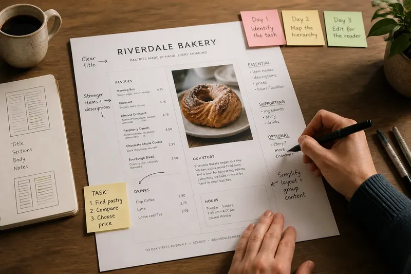
Day one: identify the reading task. Before touching type size, write down what a reader needs to notice, understand, and do. A restaurant menu might ask someone to find a dish, compare its description, then choose a price. A community notice might need the date and location to register before its background detail.
Mark the existing text in three groups:
- Essential: information needed to understand or act, such as a deadline, item name, price, address, or instruction.
- Supporting: details that help a reader choose or interpret, such as ingredients, a short explanation, or a contact method.
- Optional: repetition, decorative copy, or context that can move elsewhere without changing the main task.
Do not decide yet that optional means worthless. The point is to reveal what the page is trying to carry, not to delete by reflex. Circle any information that appears twice or serves no clear reader action; it is a candidate for editing.
Imagine a neighborhood bakery’s single-page menu has descriptions, ingredient notes, a short story about the shop, and opening details. If the immediate task is choosing a pastry, the dish names and distinguishing descriptions deserve the strongest presence; the shop story may fit better on a separate card. The expected visible result is a page with a clearer first read, not a page stripped of personality.
Where does the eye land first?
Day two: map the hierarchy. Print the page or view it at its intended display size, then look away and return to it. Note the first element you notice, the next one, and the point where you begin reading. If the first glance lands on a footnote, border, or block of equal-looking copy, the page’s hierarchy is not doing enough work.
Give each text group a role. A title introduces the subject; a section label helps scanning; a body paragraph explains; a caption or note qualifies. Roles should look distinct enough to recognize, but not so different that the page feels like several designs stitched together. Size can help, yet weight, spacing, placement, and alignment also establish rank.
Use a simple paper sketch if the layout feels hard to read on screen. Block in a large title, section names, body copy, and notes without writing every word. This exposes whether the page needs a better arrangement rather than a smaller font. If several blocks claim equal attention, decide which one should lead and let the others support it.
Make one hierarchy change at a time. For instance, increase space above section labels before enlarging every heading. A quieter body block may become easier to scan simply because its sections are separated and aligned consistently.
What can be cut or moved?
Day three: edit for the reader’s decision. Read every sentence aloud and ask what useful information it adds. Remove duplicated claims, throat-clearing phrases, and details that repeat what a label already says. Keep distinctions that affect a choice, such as whether a dish is spicy or a form requires an appointment.
Editing should preserve meaning, not turn every sentence into a cryptic fragment. Replace a long phrase with a shorter one only when the shorter wording remains precise. If a paragraph contains a side note that matters but interrupts the main sequence, move it to a clearly marked note or a companion page rather than squeezing it into a narrow gap.
Say you are preparing a two-sided event handout, and the front is crowded with venue details, a full schedule, organizer biographies, and arrival instructions. You could move the biographies to the reverse, condense repeated venue references, and give arrival instructions a distinct block. The expected observable result is that readers can locate the schedule and directions without scanning a dense wall of small text.
Keep a record of what moved. A brief note such as “organizer biographies moved to reverse” helps you check that useful content has not vanished when you review the full piece.
Can spacing carry more of the work?
Day four: test the layout before changing the type. Look for avoidable gaps, uneven margins, stranded lines, and boxes that force text into a thin column. Adjust the arrangement so related information sits together and unrelated blocks have breathing room. A modest change in column width or the placement of a sidebar may make the existing text easier to read.
Check line length and paragraph shape. Very long lines can make it difficult to find the next line; very short lines can create a ragged stack that interrupts reading. Rather than forcing a single width across the page, use a wider measure for explanations and a compact, separate area for brief details where appropriate.
Spacing is not blank space waiting to be filled. It signals which heading belongs to which paragraph, marks a pause between subjects, and gives important elements room to register. If the page looks cramped, remove a decorative rule or reduce an unnecessary box before stealing space from every line of text.
When the layout software offers paragraph spacing, use it consistently instead of inserting repeated empty lines. That makes later adjustments more predictable and helps related sections keep their visual rhythm.
When should you change the type size?
Day five: adjust type only after the page has a clearer structure. Compare the body text with headings, labels, captions, and footnotes. If all of them feel equally prominent, change their roles with a measured combination of size, weight, spacing, and placement. Do not let a caption become body copy merely because it needs to fit beside an image.
Read the page on the medium people will use: a printed proof for a handout, a full-size view for a poster, or the intended screen for a digital document. A zoomed-in monitor view can flatter tiny type; a printout reduced by a printer setting can make suitable type look worse. Check that the actual output preserves the hierarchy you intended.
If a block still does not fit, ask whether it belongs on this page at all. A reference note, long explanation, or full set of terms may be better placed on a second page or linked document, with a clear pointer from the main page. Keep essential instructions close to the action they explain.
Follow the typeface and output maker’s guidance where it affects legibility or reproduction, and account for any applicable accessibility requirements. Those details vary by font, medium, and intended audience.
What should you inspect before calling it done?
Day six: review the page in realistic conditions. Ask someone who has not followed the editing process to find a specific item, such as a date, dish, or contact detail. Watch where they look and what they miss; do not explain the page while they search. Their reading path can reveal a hierarchy problem that feels invisible to its maker.
Then check the page yourself for practical failures:
- Can a reader identify the main subject at a glance?
- Do section headings clearly separate different kinds of information?
- Are essential details easy to locate without reading every paragraph?
- Do notes and captions remain visibly secondary rather than disappearing?
- Does the page still make sense when printed or viewed at its intended size?
- Are moved details clearly signposted, with no accidental omissions or duplicates?
If a reader misses an item, first identify the cause. The information may be buried, the label vague, or the text block crowded. Change the relevant feature and inspect again rather than enlarging all the type indiscriminately.
What if the page still feels crowded?
Should I shrink the type just a little?
Only consider a size change after editing and reorganizing have failed to make the information fit comfortably. Shrinking every text style at once can erase distinctions and make the page harder to scan, so adjust only the block with a genuine fit problem.
What if every detail seems essential?
Separate information needed to act now from information useful for later reference. Give the first group prominence, then move secondary detail to another page or a clearly signposted companion source when the format allows.
Can bold text replace a clear hierarchy?
Bold can help distinguish a label, but applying it everywhere makes the whole page shout at the same volume. Combine a restrained weight contrast with spacing, placement, and consistent heading roles.
How do I know whether a line is too long?
Read several lines at the intended size and notice whether your eyes can return to the next line without losing their place. If the return is awkward, try a narrower text block or a better column arrangement before reducing type size.
How do you keep the fix from unraveling?
Day seven: make a small style sheet. Record the page’s type roles—title, section heading, body, caption, and note—along with the distinctions you chose for each. A style sheet can be a simple note in the project file or named text styles in InDesign, Affinity Publisher, or your preferred tool. It helps prevent a late revision from turning every new line into a one-off decision.
Review the finished page from the reader’s task outward: can someone find the main subject, follow the sections, and locate the detail needed to act? If the answer is yes, resist adding decorative devices simply because the page now has room. That breathing space is doing useful work.
The tiny type trap is the belief that a page can hold more simply by making every word smaller. A better crowded page design gives essential information a visible route, edits the rest with care, and lets supporting details keep their proper place. When a late addition arrives, first ask what it replaces or where it belongs; that question protects clarity before the type has to shrink again.